MOO Notebook Design
Concept, Design, Project Lead
Concept, Design, Project Lead
The People Team at MOO gave me a quick task: create a MOO Perpetual Planner design for our 2023 kickoff party. MOO was planning a wellness-themed event and wanted the planners to reflect that.
They requested options for both cloth-bound and full-wrap print designs, along with matching top sheets and bellyband designs. I had just two working days to finish it all due to tight print deadlines, and I delivered six design options.
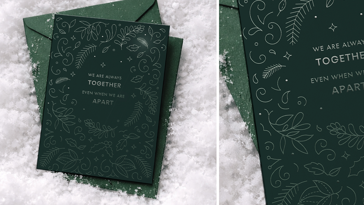
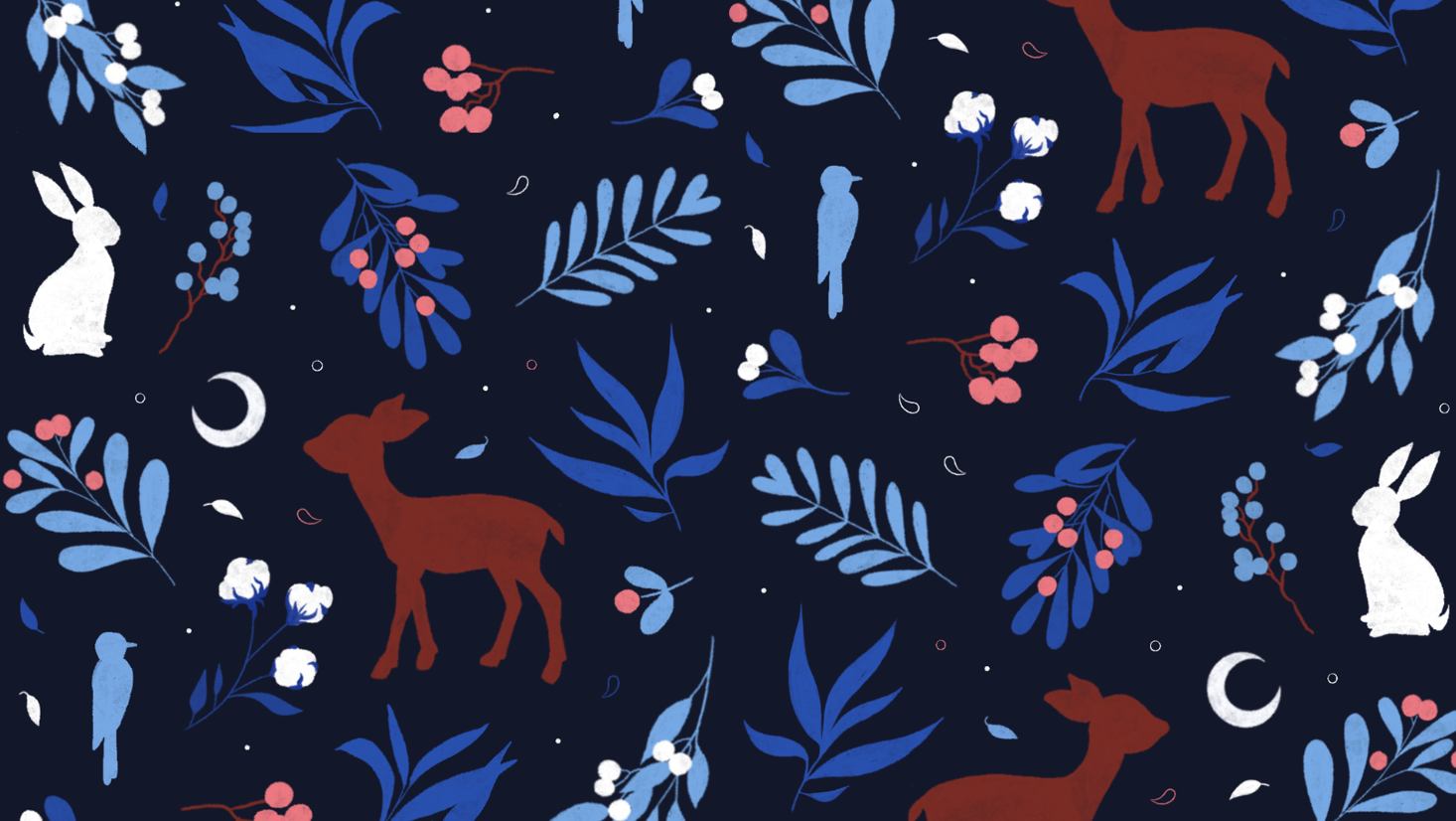
For the cloth-bound Planner, I chose a nature theme, adding small floral illustrations on the cover with a delicate touch of gold foil. I used a mixture of hand-drawn elements and digitally drawn elements. Given more time, I would have added more detailed illustrations. I chose a dark olive and a complementary rose pink as the bespoke colours for this book.
Typography graphic that I created and combined with a floral theme
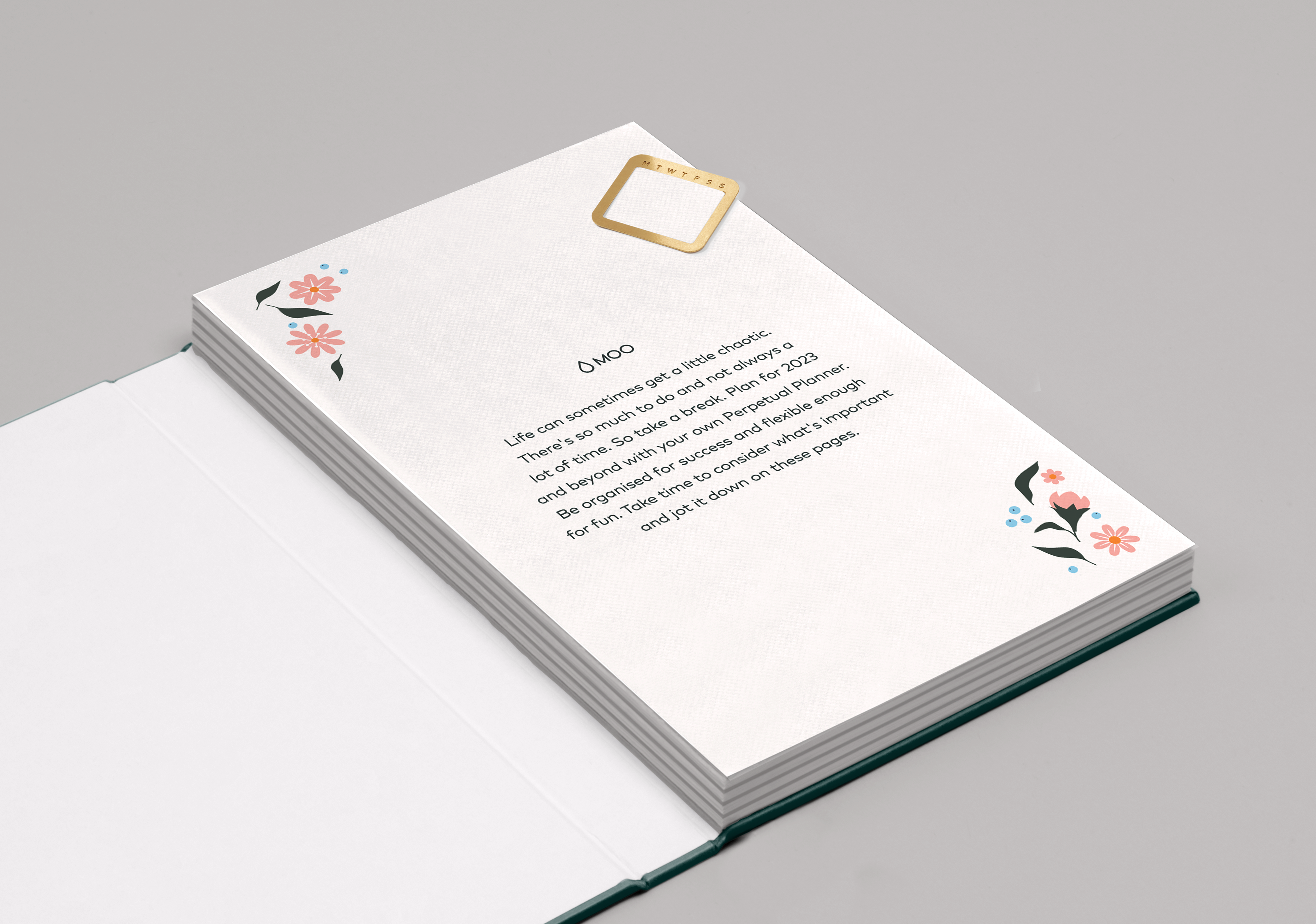
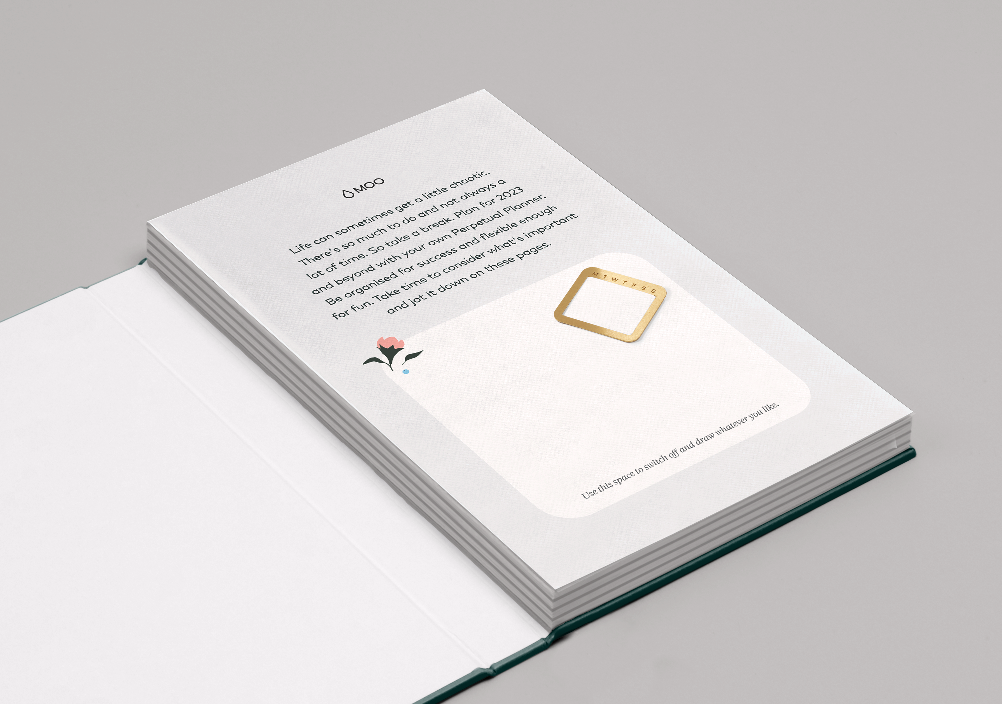
Two options were included for a matching Top Sheet. One using simple decorations to tie in the theme around the copy, and another option that had a box for drawing in. I liked the idea of making the book interactive as well as calming.
Another cloth-bound notebook option featured a bright neon theme, symbolizing the fresh start of the year. I chose a trendy bright lilac color for this one, which I anticipated would be popular in 2023. To make a strong impact, I used the same colour for the inner pages. I also suggested printing the front graphics in either White Foil or Black Foil.
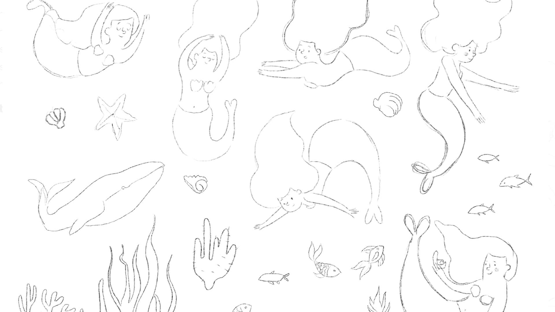
I used Illustrator to create a serene landscape scene. I drew elements digitally with my mouse and opted for a calming monochromatic palette of gradients and soft colours. The typography was crafted by tweaking a basic font and adding hand-drawn details for a script effect.
For a MOO-branded option, I utilised MOO's ink drop sub-logo to craft an infinite loop pattern. It symbolises the perpetual nature of the MOO Perpetual Planner while also invoking a sense of calm and stress relief because of the intricate design. I picked soothing blues to emphasise the calming effect, as using the wrong colours could have made the pattern appear more stressful.
The seamless pattern was repeated inside the Planner, on my matching top sheet design. I made this a colour-in page - colouring a detailed pattern is known to be stress-relieving.
