MOO Creative Brief : Pantone 2019
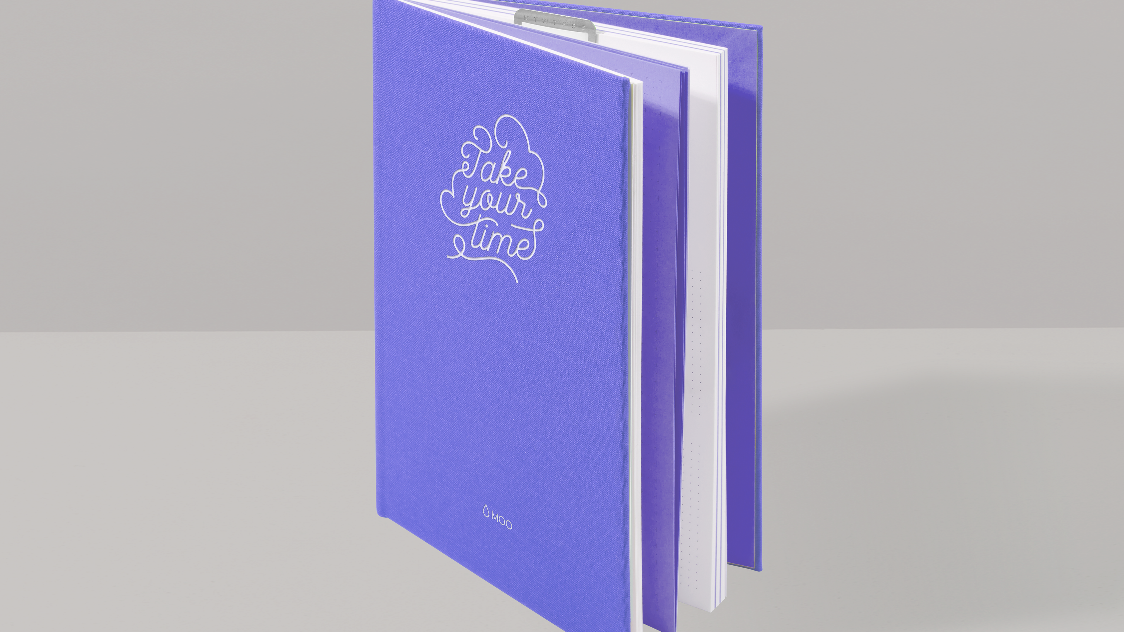
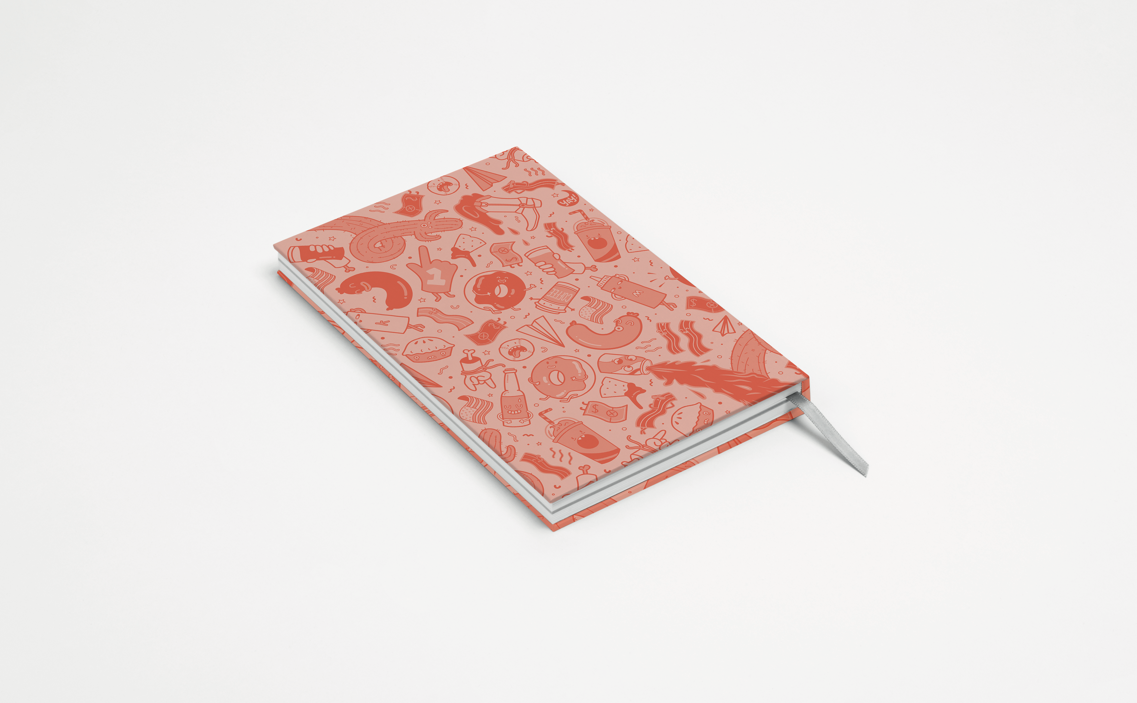
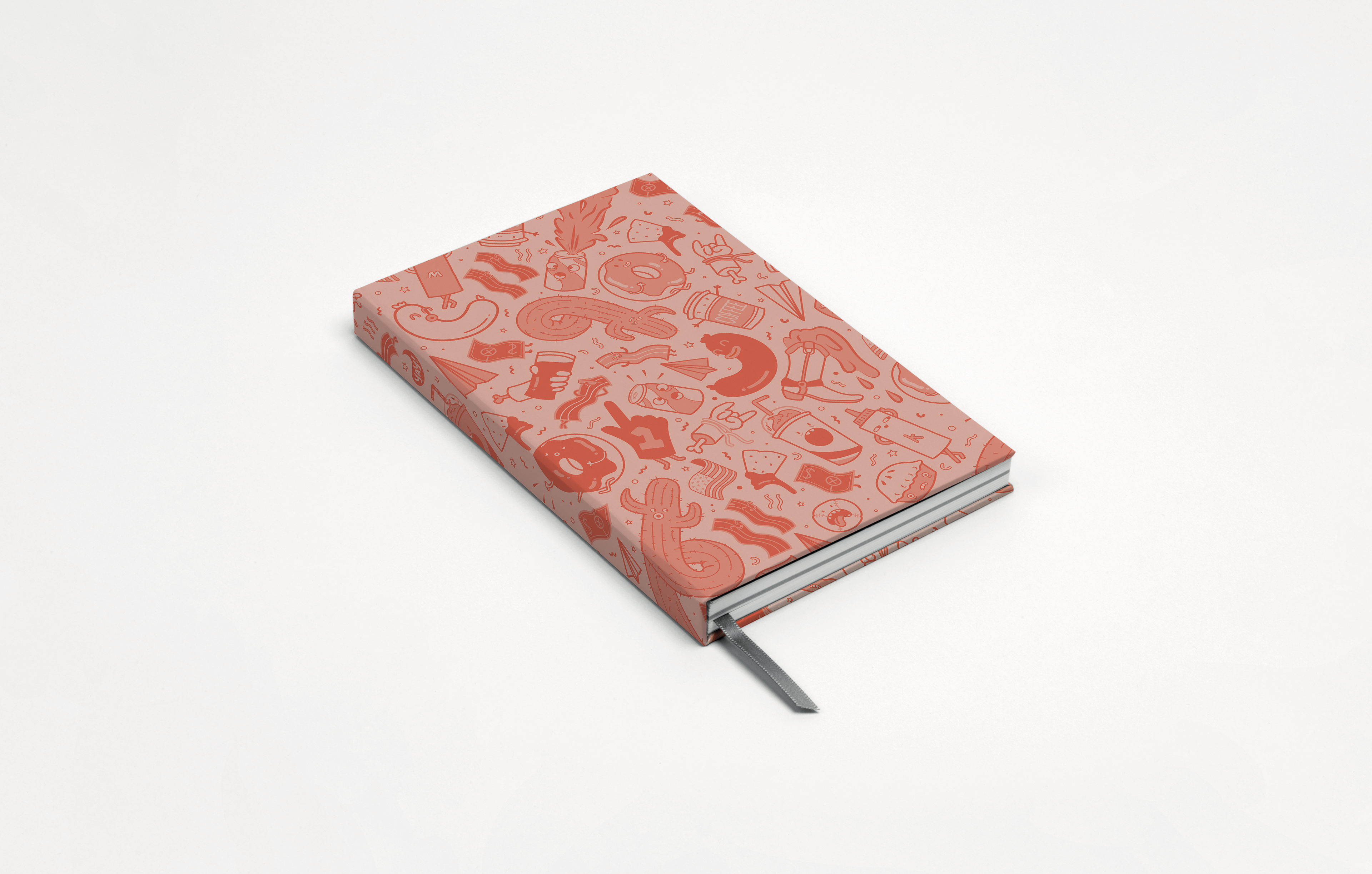
This was a short brief set by the Creative Department at MOO. The challenge was to create a Notebook Cover & Top Sheet design using the Pantone Colour of the Year 2019 : ‘Living Coral’. I decided to use a monochromatic palette using this main swatch. I wanted to create a cover that was very illustrative and detailed, and settled upon drawing my own little characters. As I was going to America that same month, I decided to base my illustrations around the US. The brief stated that the Top Sheet of the notebook must include a design quote. As my design was quite fun and cheeky, I chose the following Petrula Vrontikis quote: “Practice safe design, use a concept”
The book was printed on a MOO soft touch cover, with a Cool Grey ribbon, seam and endpaper.
The book was printed on a MOO soft touch cover, with a Cool Grey ribbon, seam and endpaper.
MOO Creative Brief : Pantone 2020
For Pantone 2020, I completed another brief by the Creative Department at MOO. Again, it was to create using
the Pantone Colour of the Year, this time ‘Classic Blue’. The brief was to create a self portrait. I decided to try
a paper cut of my illustrative portrait.
the Pantone Colour of the Year, this time ‘Classic Blue’. The brief was to create a self portrait. I decided to try
a paper cut of my illustrative portrait.
My original vector illustration using a monochromatic palette,
from the Pantone Classic Blue swatch.
from the Pantone Classic Blue swatch.
Layered paper cut version on A6 card that I hand cut using a scalpel and GF Smith card ranging from 100gsm- 250gsm.
